TE PUKE SPORTS LOGO HISTORY

The Te Puke Sports logo has an interesting history.
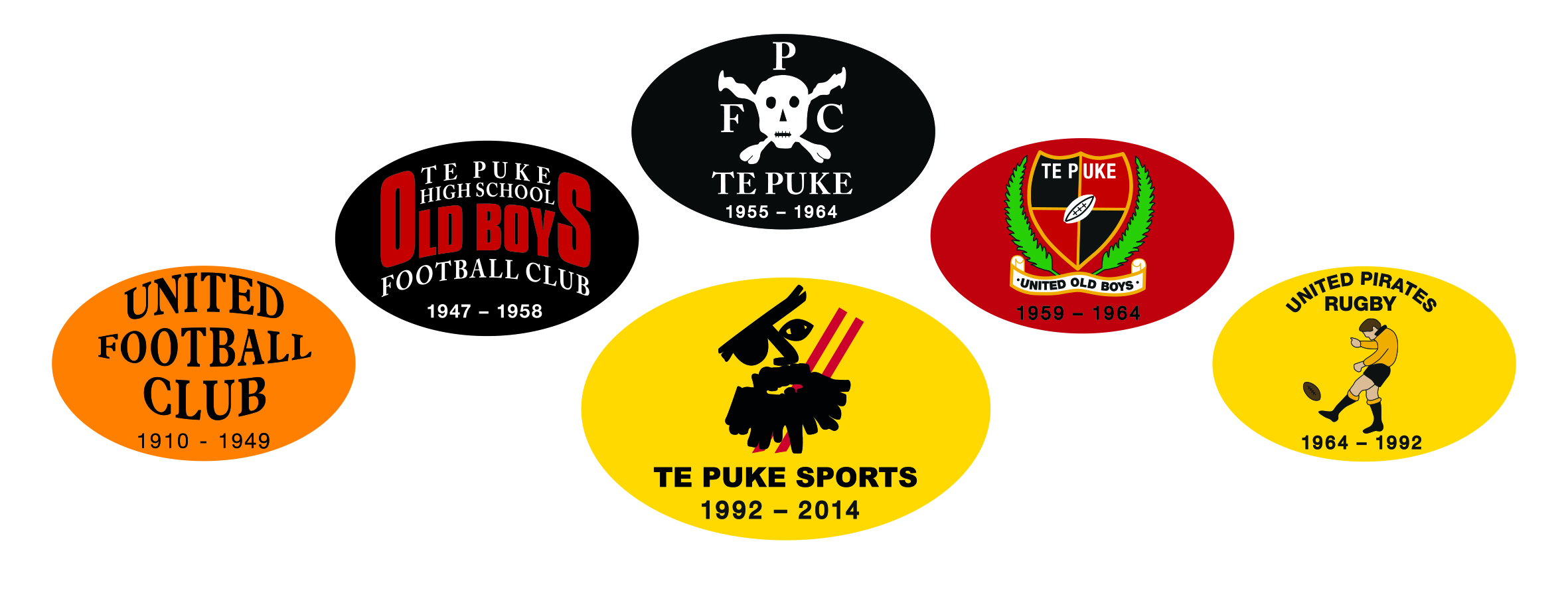
Different monograms emanating from foundation clubs have adorned our club rugby jerseys, formal uniforms, ties, stationery and merchandise over many years. These have ranged from the very traditional (United Old Boys) to the venturesome (Pirates RFC skull & crossbones) to the more mundane ‘player kicking the football’ of the United Pirates era.
A decision to re-invigorate the club emblem arose in 1988 when committee members arrived at the conclusion that the current United Pirate logo did little to represent the club and its history. To explore options, a search for an insignia that would represent the club as well as fit with club history and culture began.
An approach was made to a then current club sponsor Kiwifruit Industries Ltd. That business was managed at that time by 1974-76 All Black Graeme Crossman. K.I. was a large kiwifruit production and post-harvest corporate with headquarters located on No 3 Road.
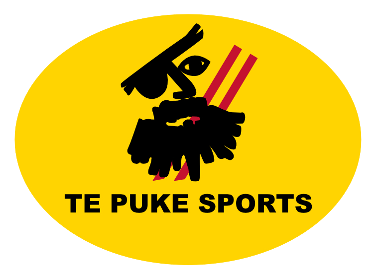
Graeme, as a mutually agreed function of sponsorship, had his company’s design-agency produce a prototype monogram for presentation to the club. He opted for a logo that was both modern in concept and at the same time represented the character of the club. Graeme presented the above monogram for consideration by the committee.
The immediate reaction of the club committee was one of disbelief and disappointment.
Recognising the subdued and somewhat negative response, Graeme suggested that the committee take a few weeks to mull over what had been presented and perhaps suggest any alterations if required.
The new concept was floated amongst the membership for a period of 3 weeks. To the committee’s astonishment the new concept sparked considerable interest. Members comments included adjectives such as unique, daring, audacious. However, the overriding response and sentiment was that “it absolutely speaks of who and what we are”. Clearly the prototype resonated with members and was seen to reflect the past and embrace the present and future. It ‘spoke’ to members with a sense of the modern mixed with the traditional.
Graeme’s concept became an outstanding success. Only two red stripes denoting the demise of the Te Puke Rugby Sub-Union introduced in 1993 has changed the original concept. These two red stripes are recognised as the ‘Te Puke colour’ and were integrated into the original concept by Danny McGinity. Coincidentally, Danny was part of the K.I. team.

